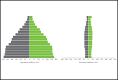
From Population Pyramids to Pillars
To give people a clear and compelling picture of world population, demographers have a favorite graphic—the population pyramid. It looks like its name: a very broad base that comes to a point at the top. Ages are displayed as groupings, and the pyramid has two sides—one for males and one for females. But for many countries, a pillar and not a pyramid is the accurate graphic. This new pillar has far more significance than a simple change in the shape of a graph. It represents a new form of society that is emerging worldwide.
Also online: Blog: Population Pyramids in Excel and PowerPoint Are a Snap |
This Blog AMICOR is a communication instrument of a group of friends primarily interested in health promotion, with a focus on cardiovascular diseases prevention. To contact send a message to achutti@gmail.com http://achutti.blogspot.com
Translate AMICOR contents if you like
Wednesday, February 13, 2013
From Pyramids to Pillars
Subscribe to:
Post Comments (Atom)
No comments:
Post a Comment