10 Million Years of Evolution Visualized in an Elegant, 5-Foot Long Infographic from 1931
Click here to see the entire histomap in large, zoomable, format.
The early decades of the twentieth century belonged to Cecil B. DeMille and his epic films both Biblical and classical: The Ten Commandments, Cleopatra, Samson and Delilah. The grand scale of these pseudo-histories required the most up-to-date cinematic invention of the day, and the most imperial vision, one later decades looked upon rather cynically. But just as the epic has roared back with a vengeance—with technological feats that make The Greatest Show on Earth look like community theater—so another medium of ambitious scope once popular between the wars has made a reappearance: the historical infographic, or as it was called back then, the “histomap"---5-foot long visual histories of a variety of disciplines.
As with film, information technology has advanced to such a degree to make this early means of condensing huge amounts of data perhaps seem quaint. But if we imagine a world pre-internet, when the prospect of visualizing a subject as complex as, say, evolution, would be daunting indeed, we might just find the histomap as impressive a means of conveying information as its early readers did. These huge graphs of big ideas, writes Rebecca Onion at Slate, fit “with a trend in nonfiction book publishing of the 1920s and 1930s: the ‘outline,’ in which large subjects (the history of the world! every school of philosophy! All of modern physics!) were distilled into a form comprehensible to the most uneducated layman.”
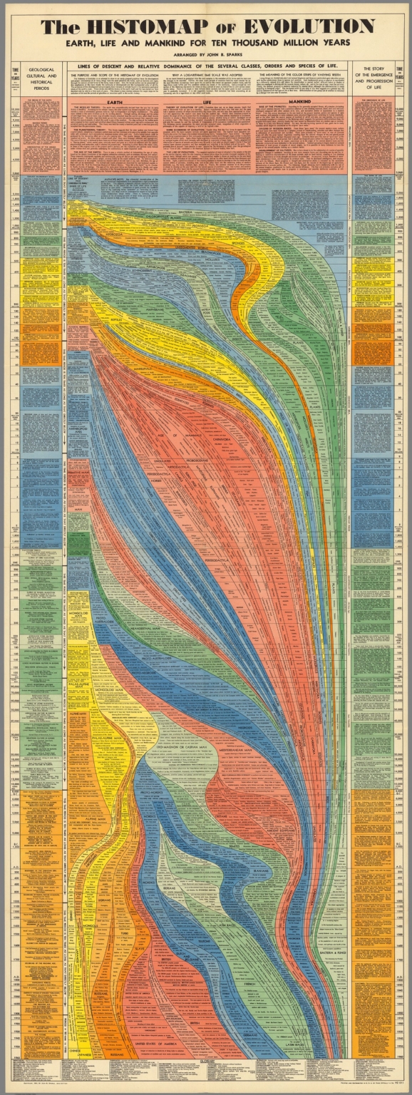
We’ve previously featured that 1931 “History of the World!” histomap, an impressive condensing of 4000 years of human activity. The evolution graphic you see here, also from 1931 and “arranged” by John B. Sparks, is equally impressive, and speaks to the times in ways that DeMille’s Bible movies did as well. Bear in mind that the Scopes Monkey Trial had only concluded six years earlier, and the country—as it is again today—was hotly divided over the subject represented here. Nonetheless, Sparks and publisher Rand McNally gamely presented this “Story of the Emergence and Progression of Life” with confident precision and without apology.
I couldn’t begin to tell you how the science here has aged, though some of it, I’d suspect, not particularly well. In any case, the form of this elegant data map, with its graceful lines of descent flowing down the page like magma, complements its content. Rather than presenting the theory of evolution as a forgone conclusion or belief, Sparks’ graphic lays out all of the evidence, and fits it together neatly and comprehensively. Some modern evolution infographics surpass the visual appeal, but not the level of scientific detail shown here. Others reduce the science, and the design, to the level of oversimplified ideology. And though we may have enough historical distance to make infographicss of hundreds of years of evolutionary thought, it may seem that the technology of the evolution infographic may not have advanced as much as we might expect.
Related Content:
Josh Jones is a writer and musician based in Durham, NC. Follow him at @jdmagness
Support Us
We're hoping to rely on loyal readers, rather than erratic ads. Click the Donate button and support Open Culture. We thank you!
No comments:
Post a Comment