A World Map Based on Scientific Research Papers Produced

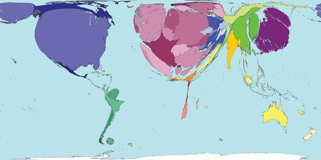
If the world were mapped according to how many scientific research papers each country produced, it would take on a rather bizarre, uneven appearance. This image makes a dramatic point about the complexities of global inequalities in knowledge production and exchange. So what is driving this inequality and how can it be corrected?
Above: If you map the world by scientific research papers produced, things look rather uneven. The Northern hemisphere would balloon beyond recognition. The global south, including Africa, would effectively melt off the map. (www.worldmapper.org)/.../
No comments:
Post a Comment