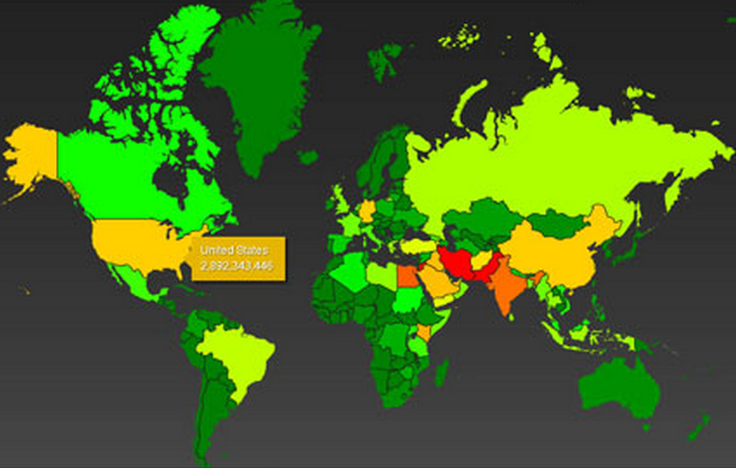
NSA’s Global Heat Map. The color scheme ranges from green (least subjected to surveillance) through yellow and orange to red (most surveillance). Note: the “2007″ date in the image relates to the document from which the interactive map derives its top secret classification, not to the map itself. (Credit: The Guardian)
No comments:
Post a Comment